Find Me...
Ratings

Archives
-
▼
2013
(348)
-
▼
July
(44)
- Some Quiet Place by Kelsey Sutton Blog Tour {Givea...
- Morai by Ruth Silver Cover Reveal
- You Are Mine by Janeal Falor Book Blitz {Giveaway}
- Beat The Heat Read-a-thon
- ARC August
- Friday Hop ~ Feature & Follow Friday and Book Blog...
- Day 15 Book Blogger Challenge ~ Book Blogging Mentors
- Diagnose Your Dystopia ~ Guest Post by JL Bryan Au...
- Guest Post & Review ~ Losing Francesca by J.A. Hus...
- Day 14 ~ Book Deal Breakers
- Review Tour ~ Speak Easy by Melanie Harlow {Giveaway}
- Sunday Post #5
- Day 13 Book Blogger Challenge ~ Under Appreciated ...
- Day 11 & 12 Book Blogger Challenge - 5 Best Blog P...
- Friday Blog Hop ~ Feature & Follow Friday and Book...
- Netgalley Knockout (July 1 - Sept 30)
- Day 10 ~ How do you choose what book to read next?
- Day 9 Book Blogger Challenge - Why do I blog about...
- Day 8 Book Blogger Challenge ~ Blog Appeal
- Top Ten Tuesday #20 ~ Authors In Need Of More Reco...
- Cover Reveal ~ Wings by Elizabeth Richards {Giveaway}
- Day 7 Book Blogger Challenge ~ Blogging Quirks
- Super Six Sunday ~ Six Series I Haven't Read...YET!
- Day 6 Book Blogger Challenge ~ Shopping for Books
- Day 5 Book Blogger Challenge ~ Tear Jerkers
- Day 3 & 4 Book Blogger Challenge ~ Book Blogging B...
- Book Blitz ~ Endure by Laura Diamond
- Author Interview ~ Arrow of the Mist by Christina ...
- Day 1-2 Book Blogger Challenge
- Release Day Book Blitz ~ Breaking Glass by Lisa A...
- Blog Tour ~ Shadow of the Mark by Leigh Fallon {Re...
- Top Ten Tuesday #19 ~ Best/Worse Movie Adaptations
- Super Six Sunday ~ Summery Six Covers
- Author Interview with Jennifer Echols ~ Dirty Litt...
- Once Upon A Read-a-thon 2013 {Sign-Up, Updates & W...
- Book Blitz ~ Rush by Eve Silver
- Summer Lovin Read-a-thon Wrap Up Post
- Day 6 Summer Lovin Read-a-thon {Update, Challenge,...
- Day 5 Summer Lovin Read-a-thon {Challenge & Partic...
- Friday Blog Hop {Feature & Follow Friday & Book Bl...
- Day 4 Summer Lovin Read-a-thon {Participation Post...
- Day 3 Summer Lovin Read-a-thon (Update, Challenge ...
- Summer Lovin Read-a-thon Day 2 (Participation Post...
- Review ~ Aurora Sky Vampire Hunter: Transfusion Vo...
-
▼
July
(44)
Blog Archive
- 2018 (79)
- 2016 (4)
- 2015 (99)
-
2013
(348)
- September(1)
- August(24)
-
July(44)
- Some Quiet Place by Kelsey Sutton Blog Tour {Givea...
- Morai by Ruth Silver Cover Reveal
- You Are Mine by Janeal Falor Book Blitz {Giveaway}
- Beat The Heat Read-a-thon
- ARC August
- Friday Hop ~ Feature & Follow Friday and Book Blog...
- Day 15 Book Blogger Challenge ~ Book Blogging Mentors
- Diagnose Your Dystopia ~ Guest Post by JL Bryan Au...
- Guest Post & Review ~ Losing Francesca by J.A. Hus...
- Day 14 ~ Book Deal Breakers
- Review Tour ~ Speak Easy by Melanie Harlow {Giveaway}
- Sunday Post #5
- Day 13 Book Blogger Challenge ~ Under Appreciated ...
- Day 11 & 12 Book Blogger Challenge - 5 Best Blog P...
- Friday Blog Hop ~ Feature & Follow Friday and Book...
- Netgalley Knockout (July 1 - Sept 30)
- Day 10 ~ How do you choose what book to read next?
- Day 9 Book Blogger Challenge - Why do I blog about...
- Day 8 Book Blogger Challenge ~ Blog Appeal
- Top Ten Tuesday #20 ~ Authors In Need Of More Reco...
- Cover Reveal ~ Wings by Elizabeth Richards {Giveaway}
- Day 7 Book Blogger Challenge ~ Blogging Quirks
- Super Six Sunday ~ Six Series I Haven't Read...YET!
- Day 6 Book Blogger Challenge ~ Shopping for Books
- Day 5 Book Blogger Challenge ~ Tear Jerkers
- Day 3 & 4 Book Blogger Challenge ~ Book Blogging B...
- Book Blitz ~ Endure by Laura Diamond
- Author Interview ~ Arrow of the Mist by Christina ...
- Day 1-2 Book Blogger Challenge
- Release Day Book Blitz ~ Breaking Glass by Lisa A...
- Blog Tour ~ Shadow of the Mark by Leigh Fallon {Re...
- Top Ten Tuesday #19 ~ Best/Worse Movie Adaptations
- Super Six Sunday ~ Summery Six Covers
- Author Interview with Jennifer Echols ~ Dirty Litt...
- Once Upon A Read-a-thon 2013 {Sign-Up, Updates & W...
- Book Blitz ~ Rush by Eve Silver
- Summer Lovin Read-a-thon Wrap Up Post
- Day 6 Summer Lovin Read-a-thon {Update, Challenge,...
- Day 5 Summer Lovin Read-a-thon {Challenge & Partic...
- Friday Blog Hop {Feature & Follow Friday & Book Bl...
- Day 4 Summer Lovin Read-a-thon {Participation Post...
- Day 3 Summer Lovin Read-a-thon (Update, Challenge ...
- Summer Lovin Read-a-thon Day 2 (Participation Post...
- Review ~ Aurora Sky Vampire Hunter: Transfusion Vo...
- June(39)
- May(54)
- April(40)
- March(73)
- February(50)
- January(23)
- 2012 (4)
- 2011 (64)
- 2010 (1)
- 2009 (60)
- 2008 (38)
Powered by Blogger.
Tuesday, 16 July 2013
Day 8 Book Blogger Challenge ~ Blog Appeal
3:59 pm | Posted by
Unknown
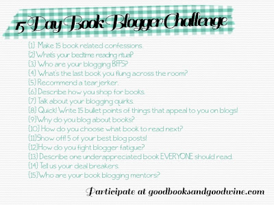
The 15 Day Book Blogger Challenge is created by April at Good Books and Good Wine. Daily for the duration of 15 days each blogger participating will post their reply to the corresponding topic above. April will post up her daily response along with a linky so that participating bloggers can leave their own link to their daily post. Click on the event banner or link above for more information or to sign-up.
Here's my Book Blogger Challenge Responses:
Day 3 & 4 - Blogging BFF's and Books flung across the room
Day 8 ~ Quick! Write 15 bullet points of things that appeal to you on a blogs!
- Clean & Uncluttered
- Minimalistic Design - I love most of the Wordpress designs.
- Search bar - I don't like blogs without search bars, or a search bar that I've got to search for!
- Cute and Attractive Designs - It may seem strange that I like both minimalistic AND designs but when I see a cute and attractive but not cluttered design, well I am more likely to go through their post contents.
- Post variety - I don't like blogs that only do all blog tours, or all cover reveals, or all memes, I like a variety of posts.
- No sounds - I really don't like the auto sounds as soon as you open a blog. I know at the moment my blog is doing it but I can't find the source of the damn noise!
- No GIF's - I know many love the GIF's but I'm just not into it at the moment, maybe I'll learn to love it in the future.
- Original features - I tend to remember blogs that have their own special features.
- Easy on the eyes - I don't like blogs that are hard to read eg. dark background with dark header and dark title that readers are not even able to see the blog's title or those that have too many moving icons/pictures or background falling stars etc.
- Ads - I don't want to see a inappropriate or non book related ads on a book blog.
- Organised - I like blogs that I can see have some sort of organisation. Tabs for features and Review archives etc. Along with an organised sidebar, all following options on one side etc.
- No CAPTCHA - This is just annoying and I'm less likely to comment on those that have CAPTCHA.
- Standout Reviews - Infused with personality, humour...just different from the other reviews.
- Themes - I love when the blogs theme is carried out from sidebar titles, any titles, ratings, contact me icons etc.
- No Videos - I don't like haul videos because I find that even my favourite bloggers do alot of unnecessary talking/teasing in haul videos. I don't mind videos that are straight to the point and with purpose.

Labels:
Challenge
Subscribe to:
Post Comments (Atom)


7 comments:
I don't typically watch videos because I hardly have my headset on or if I do I'd much rather listen to music than try to follow along to a book haul video. I do like to listen to discussion blogs but I like it even more if they give me the cliff notes of what they're saying in the video on the post. That way when I forget everything in the video, I still have some idea what to comment on.
I think it is cool how many of us mention a good clean layout that is easy to navigate. I guess we've all seen our share of blog that try to blind us.
I wasn't into GIFs either in the beginning. But then I joined Tumblr and I've been addicted since then!
I agree with no videos! Honestly, I'd rather read the review or the list of books the person got or whatever else they are posting about than watch the video. I never watch vlogs.
Well, thanks for visiting and commenting! :)
~ Hira @ Views & Reviews
Great points! I didn't even think of post variety. :)
I hate CAPTCHA & sounds too. I especially don't like sounds when I'm at work and I forget to turn the sound down on my computer, so everyone can hear if I visit a blog with sounds. It's a little embarrassing.
And I'm not a fan of ads either. When I used to have a Lord of the Rings fansite back in high school (yes, I'm a total geek), the ads angelfire allowed on the site always ended up being inappropriate. I didn't even want to tell people about my site at all, because I didn't want them to see the ads. Lol.
Hi Angelica,
The plugins that I mention are for Blogger too :-)
I use Blogger with Comment Luv.
Don't go with Disqus! It forces visitors to create an account. People can also comment as guests but then a link to their latest post won't show.
I agree with No Gif's!!! What is all the rave about it? You have to scroll down and down and down to actually find the parts of the post. I totally stop reading when I see this bunch of images in a post.
And easy on the eyes - definitely :-) I've visited blogs that, when the page loads, I get an instant headache.
I forgot about ads and CAPTCHA. I don't usually see ads since I use adBlocker. CAPTCHA's also annoy me, but I can understand them. They really do help with spambots.
Post a Comment
Thank you for stopping by at Paperback Princess. I always appreciate comments and feedback so please do leave one, and I will always endeavour to return the favour.
xoxo
Angelica